Applying Basic Data Analytics to Accounts Receivable
Briefing
Prompt collection of accounts receivable is critical to a company’s cash flow and enhances its ability to pay off short-term obligations when due. Specifically, managers need to be diligent regarding accounts receivable collection and ensure timely completion of the cash operating cycle. In order to monitor accounts receivable balances and collections, managers will determine the accounts receivable turnover rate and the number of days sales in accounts receivable. The greater the turnover, the fewer the number of days it takes to collect outstanding receivables. Managers may also provide incentives for customers to pay early in order to improve cash flow. These incentives typically include discounts for early cash payment. Sales can be increased by offering volume discounts. Generally, the volume discount is increased with the level of products purchased.
This short demonstration provides you practice in using a large data set of information related to a company’s sales transactions and accounts receivable in order to understand how careful analysis of the trends in accounts receivable collection and the use of volume and cash discounts can improve revenue and cash flows.
It is the beginning of 2020. You have downloaded a log from your company’s accounts receivable system for transactions ranging from 2015 through 2019. Your company sells one product at a price of $20.60 each. Assume that the company has a 3/10, n/30 credit policy and does not currently write off its accounts receivable.
The file contains the following information:
- Customer Number (Customer's account number)
- Sales Date (The day that the transaction takes place)
- Units (The number of units sold in the transaction)
- Gross Sales Amount (The total value of the transaction)
- Volume Discount (The total amount of available discount for the transaction)
- Net Sales Amount (after volume discount) (The value of the transaction after deducting the amount of the discount)
- Amount to Accounts Receivable (Amount of payment owned by customer)
- Payment Date (The date of the payment)
- Payment Amount (The total payment amount)
We’ll use a powerful tool within Excel spreadsheets called PivotTables to break down our data in a few different ways. Along the way, you will be asked some questions about the outputs of the data analysis, as well as your thoughts as to what is happening with the company.
Note that are different ways that this analysis could be done; this is only one example that is kept relatively simple for those who have less familiarity with Excel spreadsheets
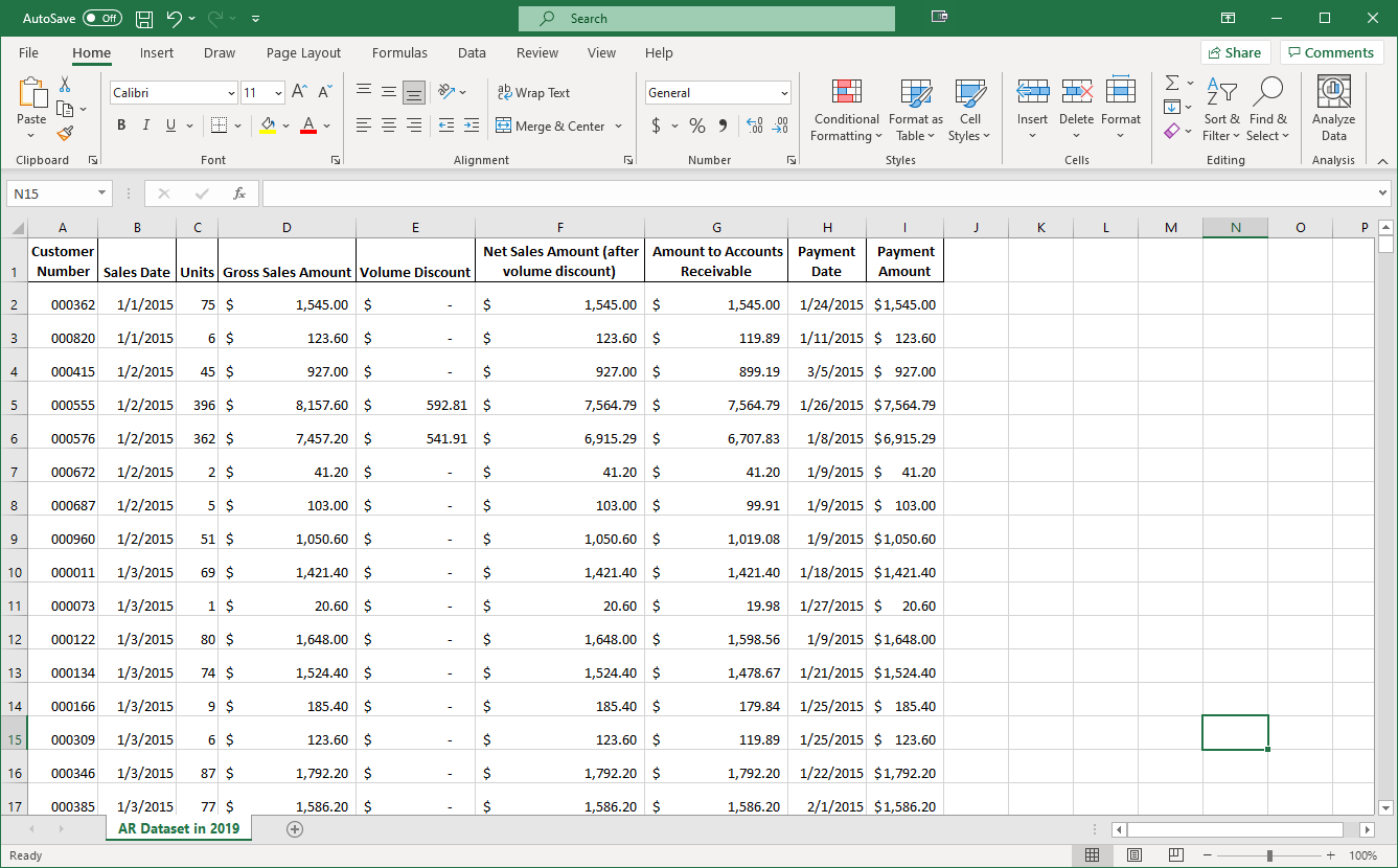
Here is the top of the file you downloaded. Let’s first determine the number of days that it took to collect payment for each sale.
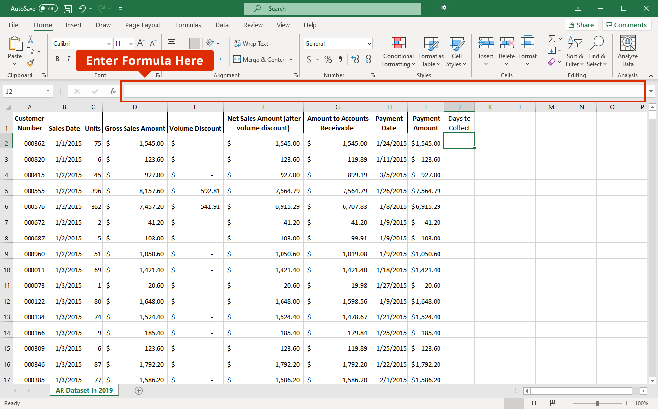
We have added a “Days to Collect” column header in cell J1 of this Excel spreadsheet. To calculate the number of days between the sale date and the collection date for our first sale (in row 2), we can subtract the sales date (cell B2) from the payment date (cell H2) since Excel knows these amounts are dates and will properly handle the number of days between the two amounts.
Let's enter =H2-B2 in the formula bar.
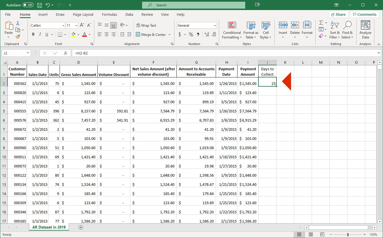
This shows that there were 23 days between the sale and when the payment was received for the sale.
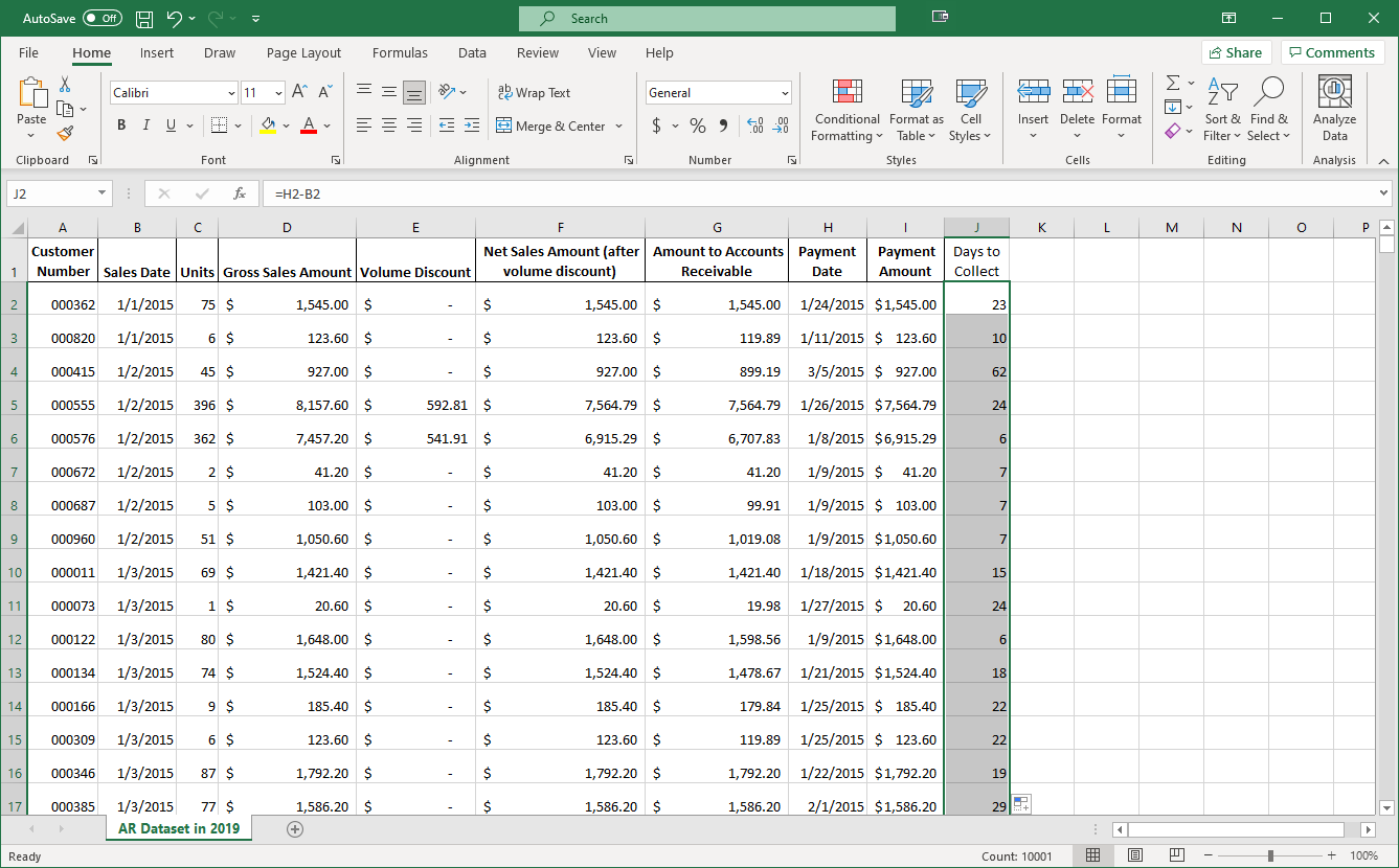
We have copied the days to collect formula down to all the sales. However, if we scroll down, you see a potential issue.
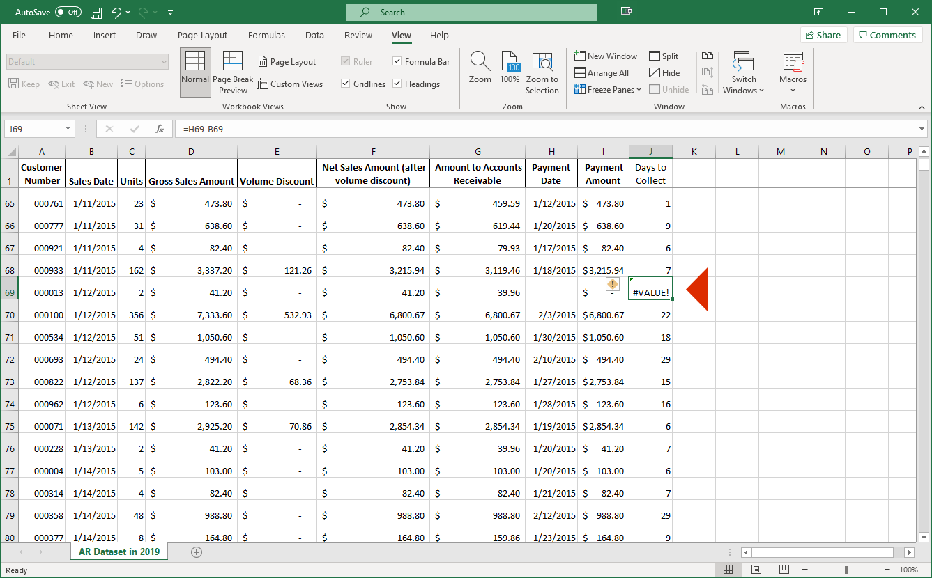
The sale in row 69 hasn’t been collected yet. Therefore, the formula we copied down doesn’t work since there is no payment date, resulting in an error. Let’s create a column for whether the sale has been collected yet to help us overcome this issue.
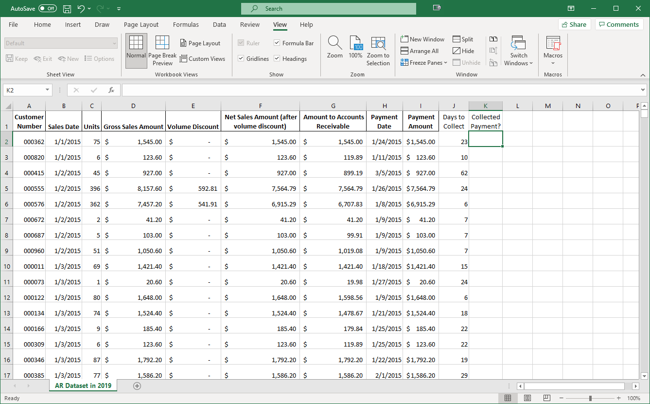
We can use an IF formula in Excel to show us whether a certain condition is satisfied. In this case we want the formula to return “Yes” if the payment for a sale was collected and “No” if it was not.
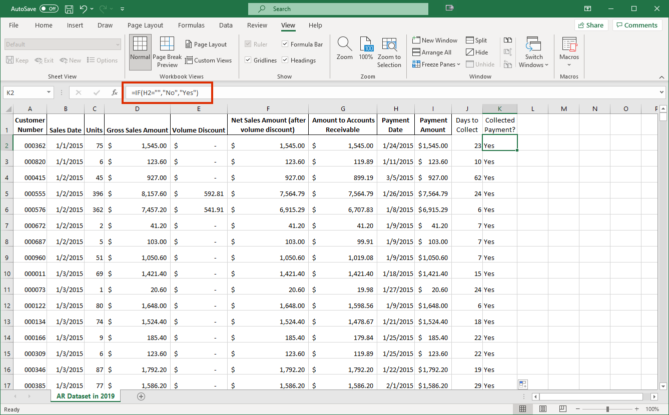
This formula, which has been copied to all of the sales for us already, will do just that. The first argument for the formula, which is everything you see before the first comma, checks to see if there is anything in cell H2. If there is not, signified by the pair of double quotation marks, the formula returns the second argument, which is the statement “No.” Otherwise, it returns the third argument, which is “Yes.” Each argument is separated by a comma.
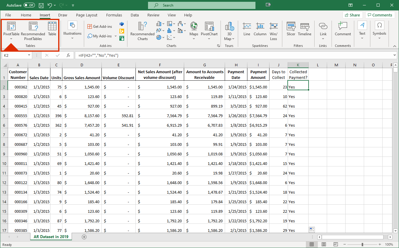
We can now do some data analysis on how long it takes our customers to pay. Let’s create a PivotTable by selecting it within the Insert tab of Excel.
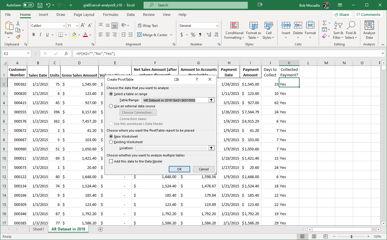
By default, Excel will suggest a range and location for the PivotTable. The defaults provided are fine, so we can select the OK button.
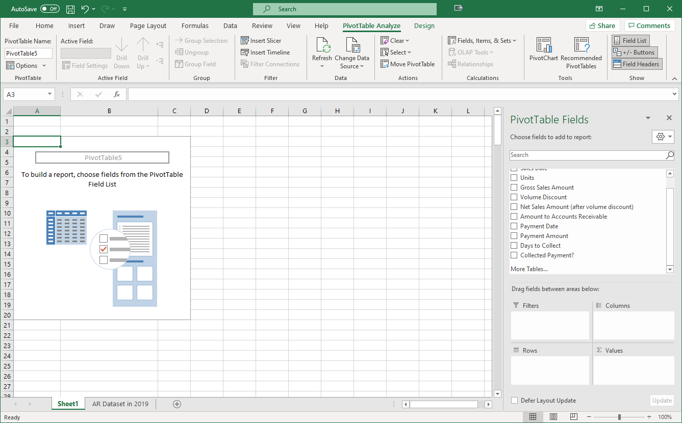
We can now add information to our PivotTable. By dragging the various fields to columns, rows, and values, we can analyze our data in many different ways.
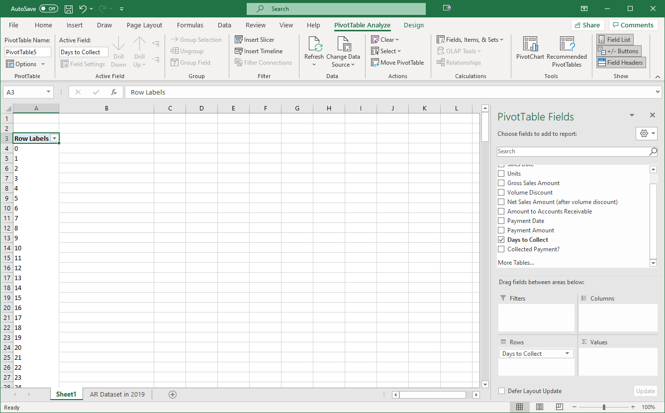
Here, we’ve dragged “Days to Collect” to “Rows”, which will provide a row for each different value in the “Days to Collect” field. However, we need to figure out how many sales we had for each of these numbers of days to collect, so we can move another field into the Values section of the PivotTable.
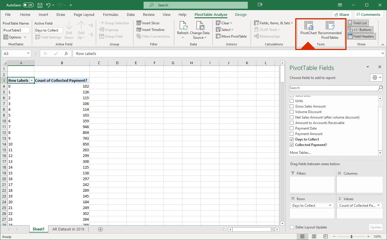
By dragging “Collected Payment” to “Values”, this provides us a count of how many payments were received for each of the possible “Days to Collect.” We can use this to determine whether our 3/10, net 30 collection policy is appropriately incentivizing our customers to both pay early. It’s a bit difficult to make sense of all these numbers, so let’s create a PivotChart to go along with our analysis by selecting “PivotChart” near the upper-right hand of the screen.
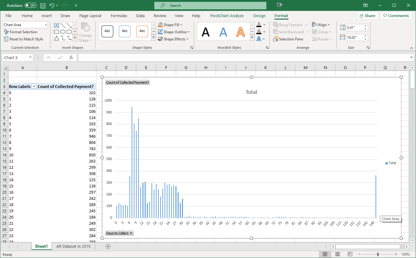
Using the suggested PowerChart, we can now examine how long our customers usually take to pay us.
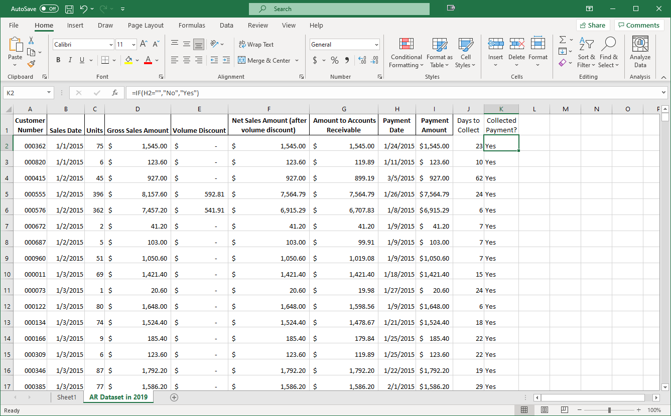
Let’s return to our dataset and examine how the company is accounting for their sales discounts.
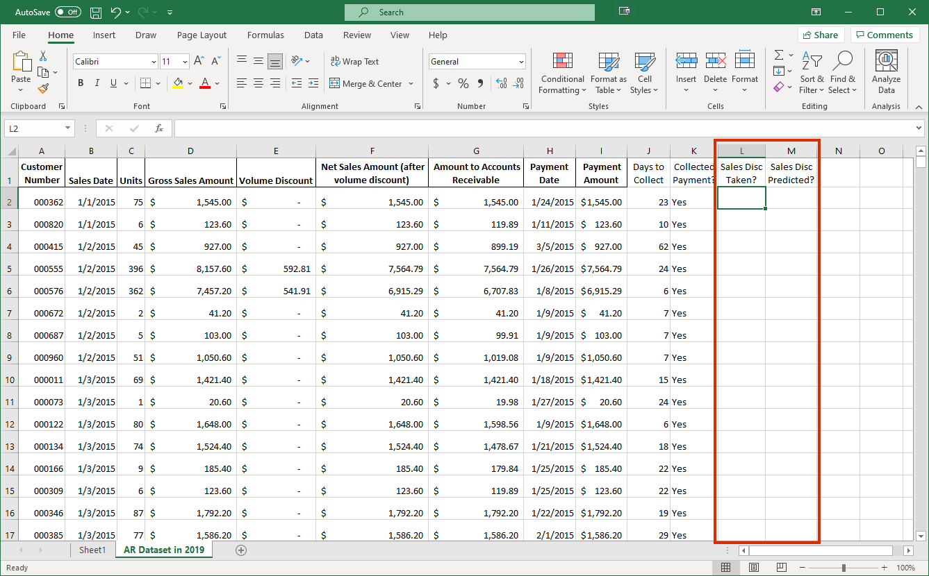
The company is using the net method, as we see that the company included a discount for some of the sales based on whether it was more likely that the customer would take the discount. We can analyze how accurate the company was in predicting whether customers took the discount. To do this, we added two columns to determine whether a customer took the discount and whether the company predicted that the discount would be taken.
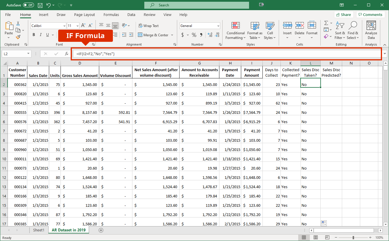
We have entered and copied down an IF formula like the one from before. This formula compares the value in cell I2, which contains the amount collected for the sale, to the value in cell F2, which contains the sales amount after any volume discounts, but before any sales discounts. If these amounts are the same (argument 1), then the formula returns “No.” Otherwise, the formula returns “Yes.” There’s a particular issue with this formula…can you see it? We’ll talk about it a little later, but we’ll leave it alone for now.
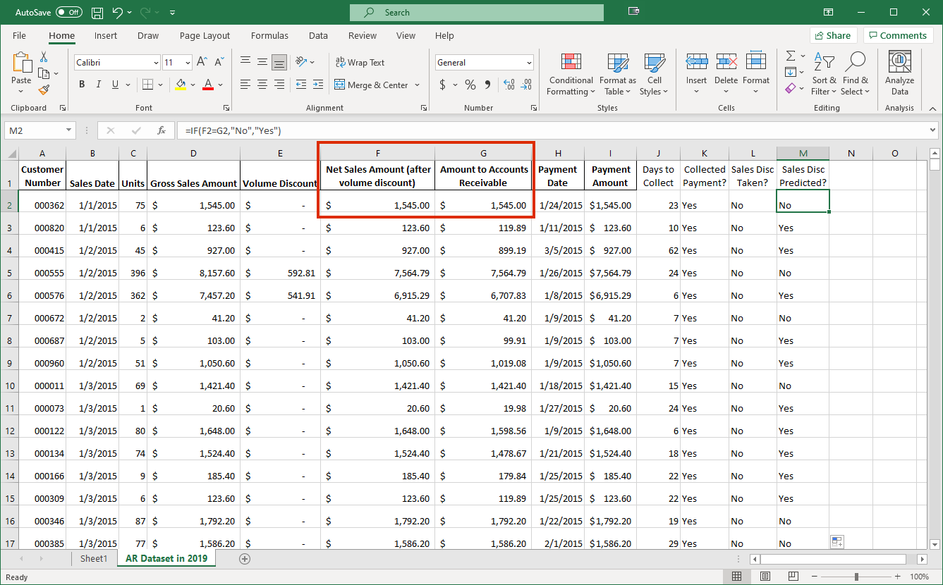
The cells we need to compare are F2 (the gross amount of the sale) and G2 (whether the company included the sales discount based on its estimate of the customer taking the discount or not). At this point, you should be able to understand the formula we used for this case, which again were copied down to all the sales transactions.
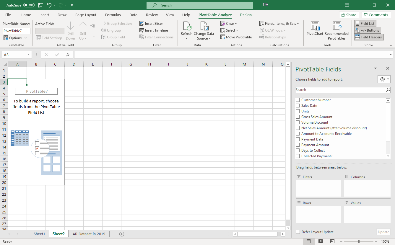
Now that we have transformed the data into a form to analyze the company’s accuracy in predicting whether customers would take the discount, we have generated another PivotTable the same way as before. We will drag “Sales Discount Predicted” to the Rows and “Sales Discount Taken” to the Columns. Since we are just determining the counts of each of these, we can use any field that has a value entered for every row in the “Values” box, as long as we ensure that it is using the count of these amounts, not the sum or average. We’ll just use “Collected Payment” here.
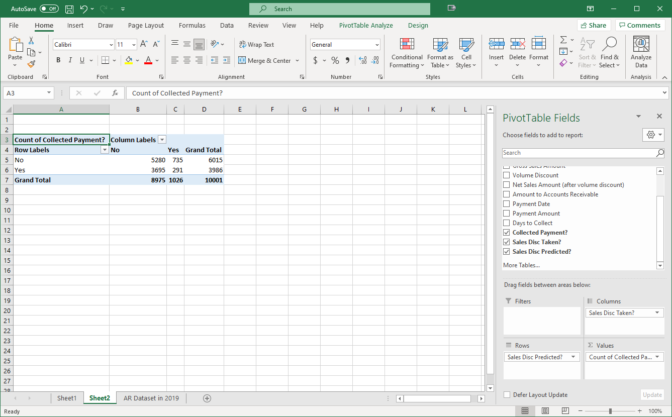
We now have the counts of our combinations of whether the sales discounts were taken and whether they were predicted. However, these numbers are the raw counts; it would be easier if we turned these into percentages. If we right-click on one of the amounts in the Grand Totals…
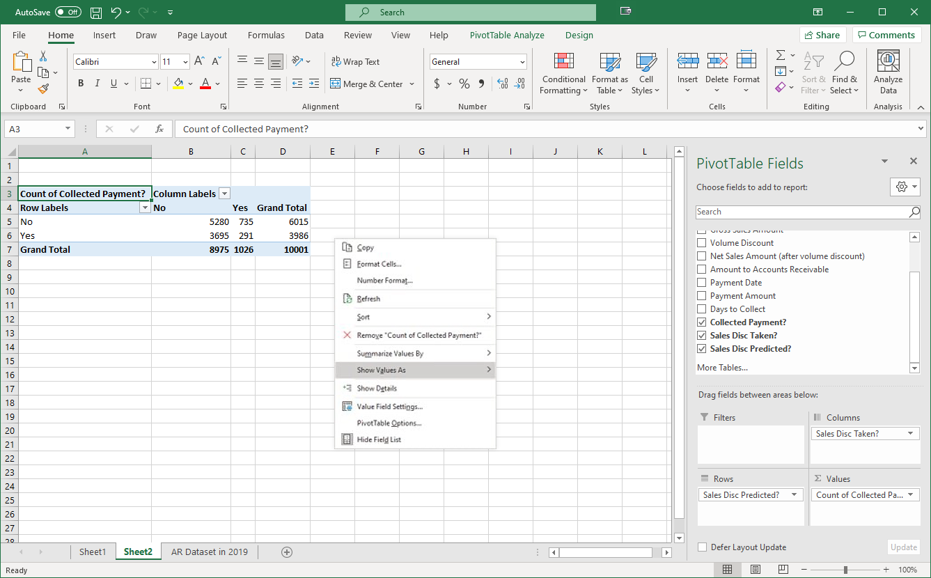
…we will get the option to show the values in a different way, and we can choose a few different options. If we choose “% of Grand Total,” which is one of the options, we get the following results.
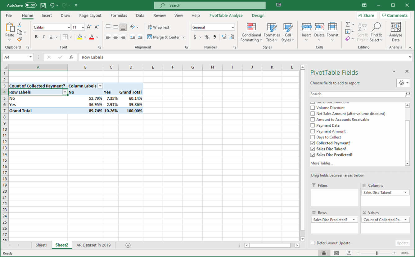
This shows us the percentage of the overall total that each of the four combinations resulting from the customer taking or not taking the discount and the company predicting or not predicting that the discount would be taken. For instance, this tells us that out of all transactions, the percentage of the sales where the company predicted that a discount would not be taken when it actually was taken was 7.35%.
We can also tell whether the company was more accurate at predicting when customers would take the discount versus when they would not take the discount. We can right-click on a total row or column and choose “% of Row Column.”

Now we can see how accurate the company was based on its specific prediction of taking or not taking the discount and how they match up.
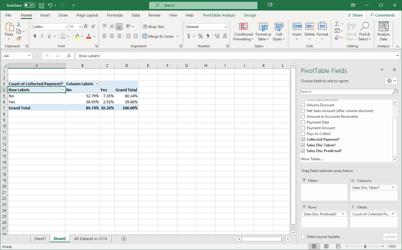
However, we noted earlier that there might be a potential issue with this formula. This formula returns “Yes” if the amounts in cells F2 and I2 are not equal. However, it doesn’t consider why these cells are not equal. The intention was that if they aren’t equal, it’s because the customer took a discount. However, if the customer hasn’t paid yet, then the cell in column I would also be empty, which would also result in a “Yes” response! We can take care of this issue back in our PivotTable.

We can add a filter to our PivotTable that will allow us to filter out uncollected payments on sales by dragging the “Collected Payment” field to the Filters area.
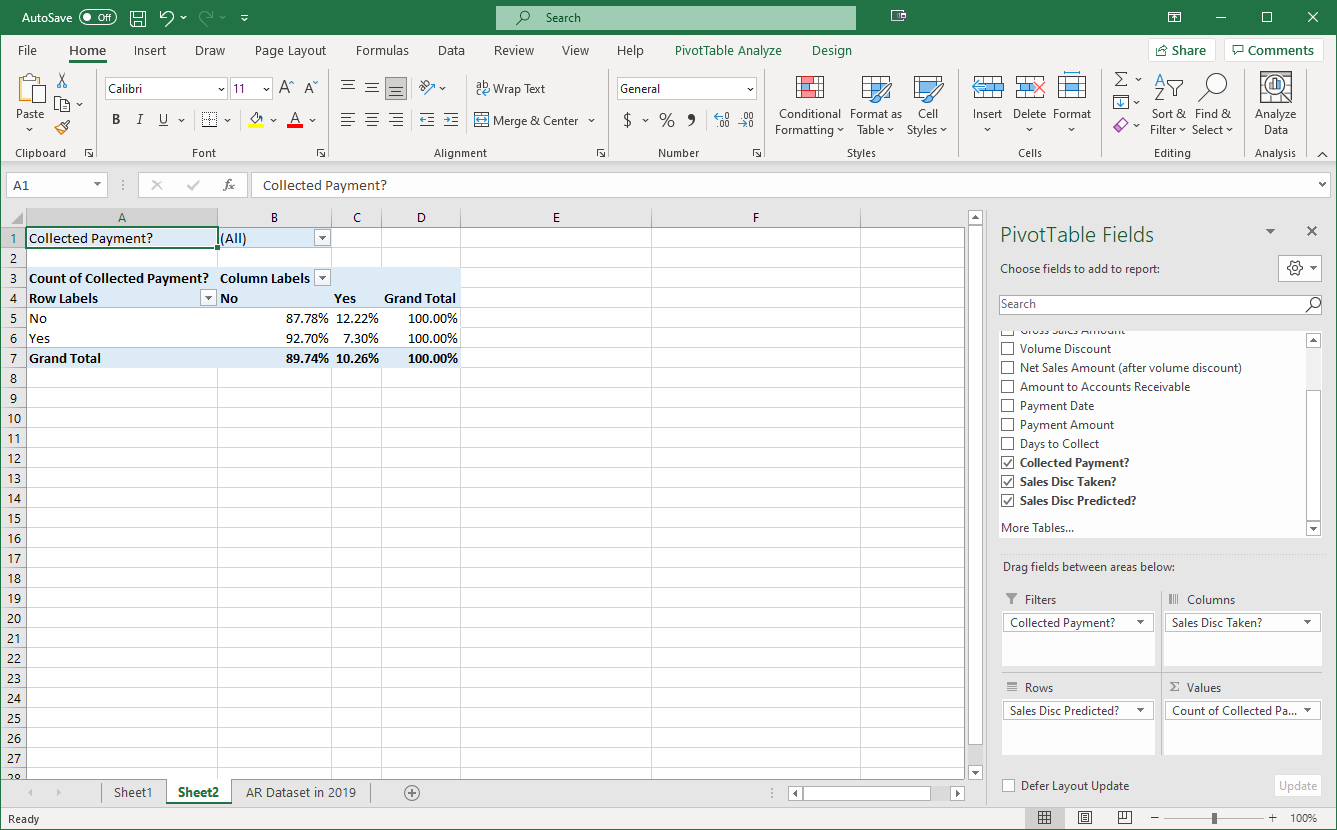
This adds a filter at the top of our PivotTable, and we can now filter the results to only show when payments were collected.

When we do this, we see that our results change. Here are the results when we show percentage totals by row…
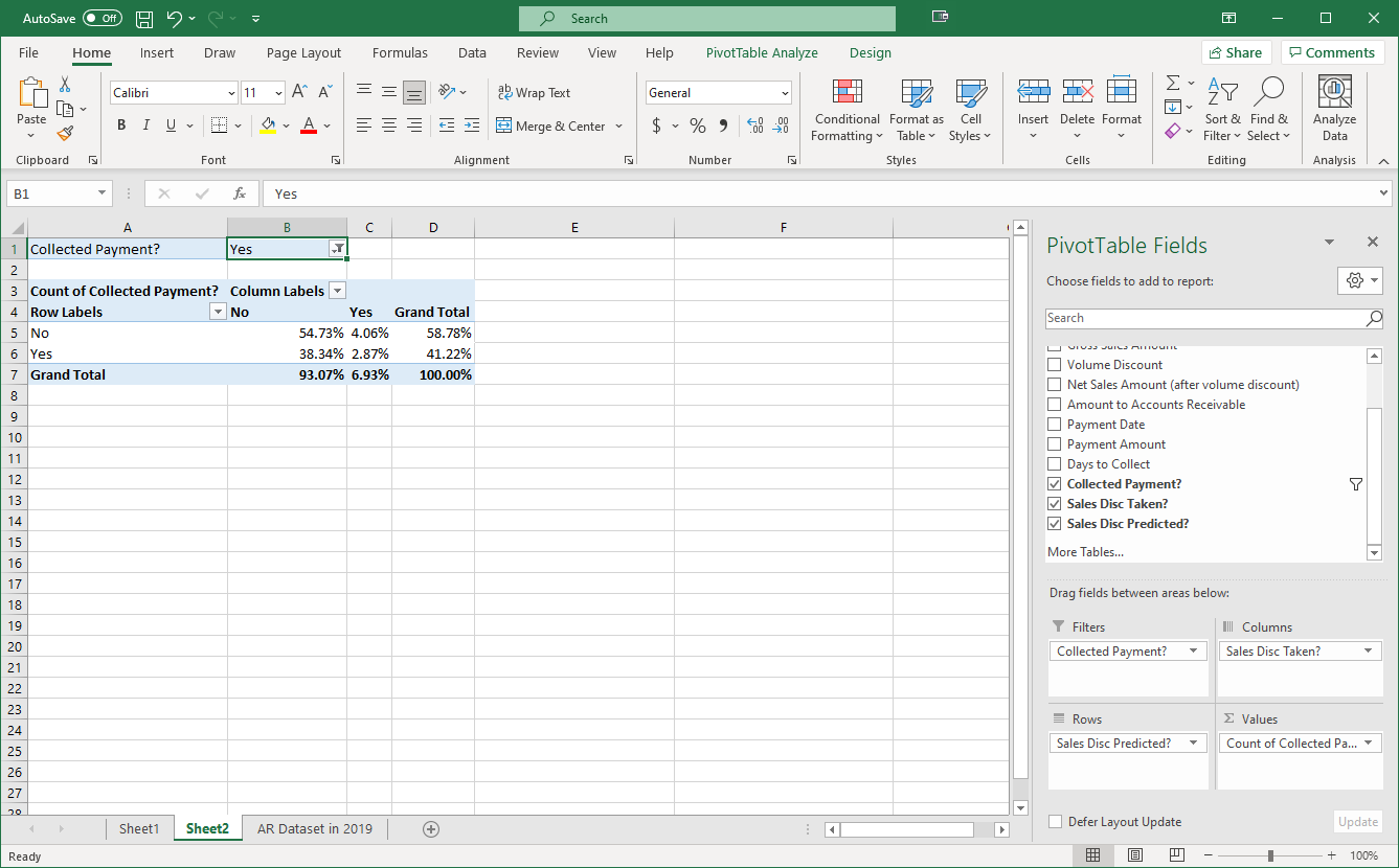
…and here are the results for the percentage of the grand total. Now we are ensuring that we are only looking at results when a payment was actually collected.

Enter your name and then select "My Responses" to get a saveable/printable summary of your answers.
Applying Basic Data Analytics to Accounts Receivable
Select the Print Results button to print or save a copy of this document. Your browser’s print window will then appear. To save as a PDF document, select Adobe PDF in the Select Printer (Firefox) or Destination (Chrome) options. Then, select Print to save this document as an Adobe PDF document to your computer.
Question 1

Q: Based on this chart, would you say the company's current credit policy is effective in incentivizing customers to pay their balances in a reasonably short period of time? Why or why not? Are many customers late in paying the amounts owed to us? With the data we have, how else could we break down the data to tell us more about sales discounts or on-time payments?
Question 2

Q: Based on what we see here, does it appear that the company is using the gross or net method to account for their accounts receivable? How can you tell which method the company is using?
Question 3

Q: If I want to determine whether the company predicted that the customer would collect the sales discount for the sale in Row 2, what two cells would I need to compare to see if they were equal or not?
Question 4

Q: Based on this information, would you say that the company is accurate at predicting whether customers would take the discount or not? Are they better in certain circumstances? What would be your next step in analyzing the data we have here to determine where the potential inaccuracies are coming from? Why?
